Products Know How, Installation,
& Cares

Frequently asked Q&A
Basic Principles of Landscape Design
By Dewayne L. Ingram
Landscaping combines elements of art and science to create a functional, aesthetically pleasing extension of indoor living to the outdoors. One initial purpose of landscape design is to blend man's technology (house or building) into the natural surroundings. To work toward a desirable landscape design, the landscape horticulturist must have a working knowledge of art elements and design principles. This publication is intended for the commercial landscaper with little or no training in the use of these basic principles. This publication is not a complete landscape design text.
ELEMENTS OF ART
Elements of art include but are not limited to color, line, form, texture and scale. These elements are never independent of each other, but we will discuss their individual natures before considering the interactions.
Color variation can best be explained by use of a color wheel ( Figure 1 ). Primary colors are red, blue and yellow. Orange, green and violet are called secondary colors because they are combinations of two primary colors. For example, yellow and red are combined to yield orange. Tertiary colors are the fusion of one primary and one secondary color. These colors would be between primary and secondary colors.
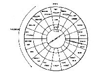
Figure 1.
Tint refers to a light value and is accomplished by adding white to the pure color on the color wheel, while shade is a dark value and is created by adding black to the pure color on the color wheel. Black, white and grey are neutrals and are compatible with any color. Light colors and tints tend to attract attention as do bright, vivid colors.
Colors are combined into color schemes for practical applications. Three basic color schemes are monochromatic, analogous and complementary. A monochromatic color scheme consists of different tints and shades of one color and is seldom achieved in its pure form in the landscape. An example of an incomplete monochromatic color scheme would include white and pink flowers with a background of a dark pink and red brick house.
Analogous color schemes combine colors which are adjacent or side-by-side on the color wheel. An analogous color scheme could include green, blue-green, green-blue, blue and violet blue. This color scheme could be achieved by varying the foliage color from green to blue-green or by using pyracantha with orange-red berries against a red brick house.
Complementary color schemes combine colors directly across the color wheel. For example, red and green would be complementary colors. A complementary color scheme may be achieved by using plants with green foliage against a red brick house.
It is possible to have varying color schemes in one area of the landscape as the seasons change. White and pink azaleas flowers can yield a monochromatic color scheme with a red brick house. The green azalea foliage would produce a complementary color for the red brick during the summer. Pyracantha berries would be an analogous color to the red brick in the fall. The landscape designer should consider the color changes throughout the year when developing a landscape plan.
Colors can be used to visually change distance perspective. Warm colors and light tints like red, orange, yellow and white advance an object or area toward the observer. These colors and tints placed near the foundation of a house would make the house appear closer to the street. Cool colors and deep shades like blue, green and black recede and can be used to make the house appear farther from the street. Cool colors are restful while warm colors express action and are best used in filtered light or against a green or dark background.
Color can be used to direct attention in the landscape. Due to this strong characteristic, color should be used carefully. When color is used for this purpose, consideration must be given to year-round color not just to seasonal color. Consideration may also be given to the time of day when this color will be enjoyed. White or light tints could be used to create interest on a patio. Dark colors would add little to family enjoyment of this area as the daylight hours passed.
Line is related to eye movement or flow. The concept and creation of line depends upon the purpose of the design and existing patterns. In the overall landscape, line is inferred by bed arrangement and the way these beds fit or flow together ( Figure 2 ). Line is also created vertically by changes in plant height and the height of tree and shrub canopies. Line in a small area such as an entrance or privacy garden is created by branching habits of plants, arrangement of leaves and/or sequence of plant materials.
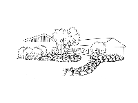
Figure 2.
Straight lines tend to be forceful, structural and stable and direct the observer's eye to a point faster than curved lines. Curved or free-flowing lines are sometimes described as smooth, graceful or gentle and create a relaxing, progressive, moving and natural feeling.
Form and line are closely related. Line is considered usually in terms of the outline or edge of objects, whereas form is more encompassing. The concept of form is related also to the size of an object or area. Form can be discussed in terms of individual plant growth habits or as the planting arrangement in a landscape.
Plant forms include upright, oval, columnar, spreading, broad spreading, weeping, etc. ( Figure 3 ). Form is basically the shape and structure of a plant or mass of plants. Structures also have form and should be considered as such when designing the area around them.
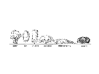
Figure 3.
Texture describes the surface quality of an object than can be seen or felt. Surfaces in the landscape includes buildings, walks, patios, groundcovers and plants. The texture of plants differs as the relationships between the leaves, twigs and branches differ ( Figure 4 ). Coarse, medium or fine could be used to describe texture but so could smooth, rough, glossy or dull.
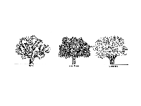
Figure 4.
Scale refers to the size of an object or objects in relation to the surroundings. Size refers to definite measurements while scale describes the size relationship between adjacent objects. The size of plantings and buildings compared on the human scale must be considered ( Figure 5 ).
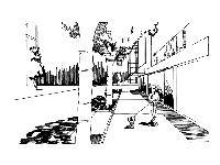
Figure 5.
PRINCIPLES OF DESIGN
Color, line, form, texture and scale are tools which are used in combinations to adjust design principles. Design principles include unity, balance, transition, focalization, proportion, rhythm, repetition and simplicity. All these principles interact to yield the intended design.
Unity is obtained by the effective use of components in a design to express a main idea through consistent style. Unity is emphasized by consistency of character between units in the landscape. Use of elements to express a specific theme within units creates harmony. Unity can be achieved by using mass planting and repetition.
Unity means that all parts of the composition or landscape go together; they fit. A natural feeling evolves when each activity area belongs to and blends with the entire landscape. Everything selected for a landscape must complement the central scheme and must, above all, serve some functional purpose.
Balance in design refers to the equilibrium or equality of visual attraction ( Figure 6 ). Symmetrical balance is achieved when one side of the design is a mirror image of the other side. There is a distinct dividing line between the two sides. Equal lines, forms, textures or colors are on each side of a symmetrical design.
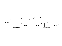
Figure 6.
Asymmetrical balance uses different forms, colors and textures to obtain balance of visual attraction. These opposing compositions on either side of the central axis create equal attraction. For example, mass may be opposed by color or linear dimension by height.
The landscape designer must skillfully manipulate the design elements to create asymmetrical balance. The central axis must be predetermined and then developed by the elements of art and other principles of design discussed in this publication.
Transition is gradual change. Transition in color can be illustrated by the radial sequence on the color wheel (monochromatic color scheme) previously discussed. Transition can be obtained by the arrangement of objects with varying textures, forms, or sizes in a logical sequential order. For example, coarse to medium to fine textures, round to oval to linear structural forms, or cylindrical to globular to prostrate plants. An unlimited number of schemes exist by combining elements of various size, form, texture and color to create transition ( Figure 7 ). Remember, transition refers to the 3-dimensional perspective of composition, not just the flat or facial view.
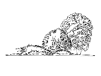
Figure 7.
It is possible to use transition to extend visual dimensions beyond actual dimensions. For example, radical lines in the private area of the landscape can be used to enframe and/or focalize a lake scene. Transition of plant materials along these lines can make the scene become a part of the landscape ( Figure 8 ). Transition from taller to shorter plants with textural changes from coarse to fine along focal lines emphasizes the beauty of a lake scene. Transition from shorter to taller plants and from fine to coarse textures would enframe the scene and make it appear closer, like a painting on a wall. Generally, transition assists in the gradual movement of a viewer's eye to the design and within it.
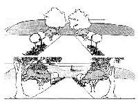
Figure 8.
Proportion refers to the size of parts of the design in relation to each other and to the design as a whole. One large towering oak may compliment an office building but would probably dwarf a single story residence ( Figure 9 ). A three-foot pool would be lost in a large open lawn but would fit beautifully into a small private area. And of course, a colossal fountain would dominate a private garden but could enhance a large city plaza.
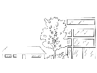
Figure 9.
Proportion in landscape design usually relates to people and their activities. The desired size relationships of components in a design should pose little problem for the designer who considers this principle routinely in systematic thought processes.
Rhythm is achieved when the elements of a design create a feeling of motion which leads the viewer's eye through or even beyond the designed area. Tools like color schemes, line and form can be repeated to attain rhythm in landscape design. Rhythm reduces confusion in the design.
Focalization involves the leading of visual observation toward a feature by placement of this feature at the vanishing point between radial or approaching lines. Straight radial lines as in Figure 10 create a strong focalization when compared to curved lines. The viewer's eye is quickly forced along straight lines to a focal point. Generally, weaker or flowing lines of focalization are desirable in the residential landscape. Transition of plants or other objects along these lines can strengthen or weaken the focalization. Curved lines are stronger when curved toward each other than when curved outward. Indirect focalization is created by lines curved in the same direction. Focalization can be adjusted by plant materials along the lines to create symmetrical or asymmetrical focalization. Asymmetrical focalization is indirect while symmetrical focalization is more direct, creating stronger focalization.
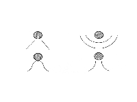
Figure 10.
Since focalization can be used to direct attention to a point, traffic in an area is usually directed to that point. Therefore, focalization could be used to direct traffic in a garden area. Guidance of view toward features of commercial, aesthetic or cultural value may attract the eye of the unaware without conscious effort.
Repetition refers to the repeated use of features like plants with identical shape, line, form, texture and/or color. Too much repetition creates monotony but when used effectively can lead to rhythm, focalization or emphasis. Unity can be achieved better by no other means than repetition. Think of repetition as not having too much variety in the design which creates a cluttered or busy appearance.
Simplicity goes hand-in-hand with repetition and can be achieved by elimination of unnecessary detail. Too much variety or detail creates confusion of perception. Simplicity is the reduction of a design to its simplest, functional form, which avoids unnecessary cost and maintenance.
STEPS IN DEVELOPING A LANDSCAPE DESIGN
The benefits of an organized system in developing a landscape design are tremendous. As with most endeavors, the level of efficiency relative to time input is greatly increased with an organized approach. The game plan for the landscape designer should follow a sequence such as the one presented here:
Steps In Design
- Develop a plot plan.
- Conduct a site analysis.
- Assess family needs and desires.
- Locate activity areas.
- Design activity areas.
- Plant selection and placement.
Develop a Plot Plan
It is difficult to visualize certain aspects of design without putting it to scale on paper. The designer should think with drawings or sketches and make the mistakes on paper not on the landscape site. The plot plan should consist of 1) accurate house placement on the lot, 2) accurate lot and house dimensions with window and door placement and 3) existing driveways and/or walks. It saves a lot of time if the customer has an accurate plat of the house and lot and a house floor plan with outside dimensions. These plans maybe secured from the builder, developer or county or city property records. Although the floor plan scale will probably be different from the scale you use, it will still be easier to convert the scale than to physically measure the house, lot, etc.
Once the house position on the lot has been determined, this should be drawn to a predetermined scale on tracing paper placed over grid paper. Commonly, 1 inch equals 5 feet or 1 inch equals 10 feet, but you may choose another scale based upon your drawing equipment and project dimensions. Recommended drawing equipment includes: drafting pencils, T-square, scaled rulers, triangle, art gum eraser, drafting tape, grid paper (8 or 10 squares to the inch) and tracing or drafting paper. The designer must have a firm, steady working surface.
Conduct a Site Analysis
A complete survey of the customer's property is essential. The plot plan will assist you in organizing the information from the site analysis. A thorough site analysis can save you time and money. Existing vegetation, natural factors and features, views, noise levels, utility placement, easements/setback lines and primary architectural features of the house should be noted.
Existing plants should be examined. Tree condition and placement should be recorded. Trees on adjoining property that would affect shade patterns on the customer's lot should also be surveyed. This information is essential to designers, especially since it is their responsibility to blend this home into the natural or existing setting, or to create a setting to be functional and to complement the structure. Shrubs, groundcovers and grasses should also be examined as to their condition and potential use.
The landscape horticulturalist may also be involved in protecting existing vegetation during construction. It may be desirable to block vehicular traffic from areas close to valuable trees.
Natural factors and features of a landscape include house orientation, land form, soil conditions, rainfall distribution, seasonal wind pattern and micro-climatic conditions. House orientation affects the exposure of various portions of the house to the sun ( Figure 11 ). This knowledge is essential so the designer can provide shade in important spots and locate activity areas appropriately. For example, a southeastern exposure is generally the most comfortable spot year-round while a western slope will be hot in the summer and cold in the winter.
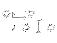
Figure 11.
Land form refers to slope or land elevation changes. It determines surface water drainage patterns and is essential knowledge for the landscape horticulturalist in developing functional and aesthetically pleasing landscapes.
Soil characteristics will determine selection and placement of plants. Soil pH, nutrient and waterholding capacity and drainage should be considered. Native fertility levels and soil characteristics may be indicated by existing vegetation. Turkey oaks on the property usually indicate dry, infertile soil. Native cypress trees usually indicate poorly drained soils exist or did exist in that area.
Rainfall distribution can be determined on a regional basis. Periods of heavy rainfall can magnify the problems of shallow soils or a hardpan resulting in unwanted standing water. Sometimes these conditions may require the engineering of drainage modifications by some type of tiles or pipe. Often the conditions simply require careful plant selection.
Predominate wind directions differ with the area of the state, the season and the time of day. Where the wind direction differs in summer and winter, plantings can be arranged to block the cold winter winds from a patio and direct summer breezes into this same area ( Figure 12 ). While conducting the site analysis, be sure to look for existing wind breaks provided by plants and structures on the property or on adjacent property.
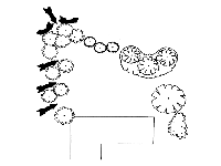
Figure 12.
All of these factors interact to create micro-climates. This means that the conditions in a isolated spot may differ considerably from the conditions in another area of the landscape. The designer must consider those variations in order to "fine-tune" the landscape plan and plant selection.
Views should be identified that are to be preserved or accented. Likewise, less desirable views must be considered so screening can be planned. Views and activities 30 feet (9 m) or so from the property line must be surveyed. During the site analysis, views should be observed from inside the house to outside and from outside to inside the house ( Figure 13 ). Observe the neighbors' property from positions on the customer's lot and view the customer's property from the neighbors' lots if possible. The house should also be observed at multiple angles from the street. Pictures from an instant camera can be helpful in reminding the designer of specific views when sitting back at the drawing table.
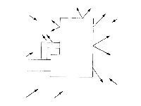
Figure 13.
Surrounding distractions must be identified. You may need to question neighbors or the property owner about these factors. Record a noise source like roads, factories, saw mills, etc. and plot the direction and distance of the source. The time of day for peak noise levels can be important as well. It may be necessary to return to the site during such a period. Other distractions could include glare or odors.
Utility lines may be on poles or underground. Locate the position of these on the plot plan. Also locate the electrical meter on the house, the air-conditioner unit and water outlets. Consider the position of television and telephone cables, water lines and sewage lines, or a septic tank and field line. Television cable companies and the telephone company will usually locate their service lines accurately. However, these services must be requested in advance.
Architectural style of the house is of primary importance. Specific details of interest must be identified during the site analysis. Things like the height of windows, the height of house corners from the ground and overhang widths should be considered. Is the house guttered or should it be? If so, locate the outlets. Notice major traffic problems so proper access and movement can be provided.
Assess Family Needs
A landscape should be an outdoor extension of indoor living areas. It should be functional and provide space for family activities. Before the designer can create such an environment, knowledge of certain family characteristics is essential.
The questions used in the form at the end can be among those asked of the customer.
Locate Activity Areas
Once the family needs have been determined, areas for these activities must be located on the property. Their placement should be considered in terms of the house plan and in relation to other activities in and adjacent to the property. These activity areas could include a public area, entrance, living area, quiet zone, service and work area, or vegetable or cut-flower garden plot.
These areas should be defined on the plot plan or maybe on a piece of tracing paper laid over the plot plan. Actually sketch the outline of these areas ( Figure 14 ). Be sure to include all needed activity areas and draw them to scale and to the size necessary to accommodate the activity, yet still fit within the property lines.
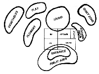
Figure 14.
Two major considerations for the placement of areas must be emphasized. 1) Place outdoor areas in relation to indoor activity areas ( Figure 14 ). The outdoor living or entertaining area should be an extension of the family or living room in the house. The service area and work area may be an extension of the laundry room, kitchen or garage. 2) Arrange areas relative to the activities in each and activities on adjoining property. For example, do not position the children's play area beside the quiet zone. Always leave a clear view to the children's play area from some identified observation point like the kitchen window.
Design Activity Areas
A systematic approach should be taken in designing activity areas. First, determine the objectives of the design and establish the general type of plan formal or natural. Plan for structural needs, consider land form modifications, determine traffic flow, develop bed form and then specify plant materials.
Structural needs should be considered first. If a storage building is needed, a level spot and access must be planned. Required access may mean a path or limited vehicular access to haul in firewood, etc.
Land form information derived from the site analysis can be used now. Do surface water drainage problems exist? If so, determine how to correct them. Engineering and legal considerations are involved in major surface water drainage problems. Seemingly simple solutions may affect someone else's surface drainage. Consider grassed waterways, paved waterways or possibly drainage tiles. Drainage problems may not exist but land form modifications could be used to create interest, or help block undesirable views or noise. Care should be taken not to create surface water drainage problems with land form modifications.
Existing land form may have slopes which will erode. Existing slope or steepness will determine what actions should be taken. Ground covers may be the answer for long, gentle slopes while terraces with railroad ties or blocks may solve the problem of a short, steep bank. Grass should not be put on slopes greater than 1:6 (1 foot of rise per 6 feet of run) because of maintenance safety. Other ground cover materials will probably hold a 1:2 or 1:3 slope. Bark mulch should not be placed on a slope greater than 1:10.
Bed form, traffic flow and plant selection and placement utilize art elements and design principles previously discussed. These can best be covered as the development of specific areas is discussed.
Public Area. The public area is the portion of the residential landscape the public sees and uses. The current trend toward smaller residential lots encourages the development of some of the front yard for family living. The public area contains the driveway, parking, walks, open space and entrance area. The purpose of the public area is to enhance the home, provide comfortable access and lead the visitor to the entrance.
Foundation planting is not all of landscaping but can be a vital part of functional landscape design. Too often foundation planting is overdone and left to stand along. History reveals that foundation plantings were used to block the view of raised foundations and to slow cold air movement under the house ( Figure 15 ). Although these needs do not often exist today, some landscapers and homeowners think it is a must to cover every linear foot of the foundation with plants.
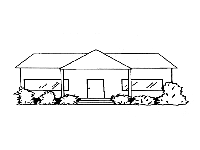
Figure 15.
The objectives of foundation planting are to focalize the main entrance, compliment the architectural style of the house and to break long continuous lines of the house and blend it into the surroundings. The designer should avoid competing elements which detract from the main entrance and the house in general. An isolated bed in the middle of open lawn area is one of these competing elements. Plants should be selected which can easily be maintained to proper scale with the house. This is probably the most common failure of foundation plantings.
A general rule of thumb is that the height of plants in the foundation planting should not exceed two-thirds the height of the wall at house corners ( Figure 16 ). Generally, plant height should not exceed the height of a line extending from the doorway to this imaginary point at the house corner. This does not mean every house should have plantings this high.
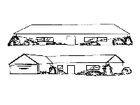
Figure 16.
Balance in landscape design is not always necessary. Imbalance may be used with architectural features of some houses to create desirable, interesting effects. However, when balance is suggested, it should be achieved.
Symmetrical balance has been overdone in residential landscape design. This approach seems formal and monotonous ( Figure 17 ). Asymmetrical balance is often more desirable for residential landscapes as balance is created without monotony. Size is balance by mass and texture in this example. Architectural style may dictate the use of symmetry or asymmetry. Driveways, parking and walks must be functional. They must be positioned to provide easy access from points of entry onto the property to the entrance of the house. Too often walks are placed from the street to the front door with no consideration of access from the driveway to the front door. Many times a walk dividing the front yard is not necessary and may detract from the house.
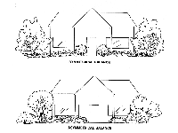
Figure 17.
Walk and driveway surfaces should be selected based on traffic demands. Low traffic walks and driveways may be surfaced with less expensive materials such as bark or gravel, but walks and driveways with high traffic demands should have a hard surface.
Walks accommodating two people abreast should be at least 4 feet (1.2m) wide ( Figure 18 ). Walks for one person should be at least 30 inches (74cm) wide (Figure 18). A straight driveway for one car should be at least 8 feet (2.4m) wide while 14 feet (4.3m) is required for two cars side-by-side. Circle drives should have a minimum inside radius of 18 feet (5.5m) and an outside radius of 32 feet (9.8m) with a surface width of 14 feet (4.3m). Steps should be designed with human comfort as the top priority. Generally, a taller step, one with greater rise, should have a longer tread area. A handy rule of thumb states that twice the rise in inches plus the tread should equal 26 or 27 ( Figure 19 ). Ramps for wheelchair access are necessary or desired in some residential landscapes. The average wheelchair user can negotiate a 5 percent gradient independently and the minimum width is 3 feet (90cm). The bottom and top approach to a ramp should be clear and level for a distance of at least 5 feet (1.5cm).
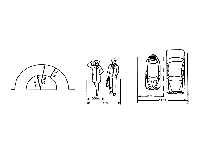
Figure 18.
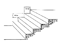
Figure 19.
Driveways must be wide enough at the street to allow cars to merge easily into the flow of traffic. The higher the average speed of the street traffic the wider the mouth of the drive should be.
The view of street traffic from the driveway entrance should not be blocked. Large plants placed along the driveway entrance create a dangerous situation. Plants on the outside of a curve in a driveway or highway aid the driver by giving definition to the traffic flow. Make sure such a planting blends into the total design. A plant screen on the inside of a curve in a driveway or highway is hazardous because it blocks the driver's view of the road ahead.
Trees can be used in the public area to soften lines, provide shade and enframe the house ( Figure 20 ). Also trees placed in the backyard can provide an excellent background for the house as viewed from the street. Vertical lines of many houses can be effectively softened by a small tree planted in conjunction with other plants at a corner. Tree shape is very important. A low-branched, rounded tree softens this line while a slender upright tree only accents the line. Trees with a lot of exposed trunk, like a sabal palm, will also accent and not soften these vertical lines.
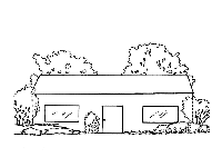
Figure 20.
A long low house (ranch style) can be made to appear taller in relation to its length by proper placement of plant materials ( Figure 21 ). Larger trees planted as a background break the horizontal roof line. Smaller trees spaced a few feet from the ends or corners of the house would also help the house seem taller in relation to its length.
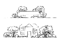
Figure 21.
A tall slender house seems longer when few or no trees are placed in the background but medium-sized, rounded trees are positioned on either side of the house ( Figure 21 ). Plants placed near these trees should be shorter and decrease in height the farther from the house they are positioned. This planting design effectively created a sloping line to replace the strong vertical line of the house. The house then appears longer in relation to its height.
Trees positioned for shade must be carefully located. The designer must learn what area needs shade, and during what time of the day and what seasons the shade is needed. This information will determine where to plant the trees relative to sun angle, sun direction and areas to be shaded.
A moderate amount of open area in the front yard can create the feeling of a large expansive area that allows the observer's eye to move from the street to the planted areas. The planted areas can then direct the observer's eye to the appropriate place. Some family game activities need not be in the private living area and can be accommodated by open portions of the public area.
Entrance. The entrance should be an area of transition between outdoors and indoors. Considerable detail should be given to the planning and maintenance of this area. This is true because a visitor is close to this area and moving slowly or actually standing still. Therefore there is time to view this area and a favorable impression can be developed before a person enters the house.
Plantings in the public area should focus attention to the entrance. This means there should be no doubt in the visitor's mind where to enter the house. If the house is approached commonly from more than one direction, the focalization of the entrance form these different perspectives must be considered. This focalization is achieved through repetition of plant masses ( Figure 22 ). Transition of plant form, color and texture and the bed lines can help direct attention.

Figure 22.
Focusing attention toward the entrance is not the same as accenting the entrance or access area. Plantings, like liriope, along both sides of a walk in the open lawn only draws attention to or accents the walk. These do not direct attention to the entrance, but actually distract the observer's attention from the entrance area to the walk itself.
There should be a feeling of intimacy or comfort with limited exposure when a person is standing in the entrance area. Security and the need to focus the entrance may dictate the extent of exposure in this area. In a outdoor public area for a larger home, an extensive entrance garden may be appropriate. Be careful to keep this area in scale with the house and its surroundings. These areas are sometimes called "good night" areas, because they provide an effective transition between the indoors and the vehicle parking outside.
Living area. Elements in the living area, primarily the backyard, depend upon the desires and needs of the family. These desires and needs were determined during the interview outlined previously. This area must be clearly organized to avoid wasted space. Living area space must be organized based on the activities to be included there. Consideration is given to the house design, land form and house orientation as they relate to space organization.
Private area(s) are usually a part of the living area. A private area may be for reading and meditation as an extension of the master bedroom or it could be an area for small group conversation as an extension of the living room. A private area may be placed close to the house or in an isolated corner of the landscape.
Space and equipment for children's play are required in many landscapes. The play area should be an integral part of the landscape. Enclosure of this area may be required, based on age of children, size of area and activities on adjacent property. The permanency of the play area depends upon the ages of the children and family plans. If the children are 8 to 10 and no other children are expected, the area may be temporary and plans for future modification should be suggested to the customer.
The children's play area may require some open space. This space may also serve for adult entertaining. Planning for multi-use space of this sort can lead to high space utilization and efficiency.
It is often important to provide a degree of privacy in the living area. Fencing, walls or plants used for this purpose can also block views, enhance views and direct or block prevailing winds.
Structural features in the living area could include a patio, deck, terrace, water feature and/or garden and workshop. A patio used as an extension of the family room should be at least 12 feet by 15 feet (4m by 5m). The selection of surface material is based on land slope, expected use rate, style of the house and the amount of funds available. Raised wooden decks are suited for sloping land and are cooled by air flow beneath them. Brick and sand is less expensive than brick and cement and if installed properly can be quite durable. Stained concrete and concrete with an aggregate surface are also alternative surfaces for patios.
A water feature could be a swimming pool, spa, or a simple reflection pool. Moving water creates a secure, relaxed feeling in a private area and is often overlooked for this use. Expense of these items is often the limiting factor.
The designer should be concerned with traffic flow and circulation in the living area. Each unit in this area should be a part of the whole and contribute to the overall circulation pattern. This is especially true in the areas where entertaining is planned. Areas of limited access, like service areas, may not be a part of this circulation pattern. Circulation refers to the movement of people's eyes and then their bodies through a specific pattern in the landscape. For example, a quiet sitting area located in the back corner of the lot is hidden from view of the patio ( Figure 23 ). Proper bed arrangement and plant selection will lead the observer to one focalization point in the landscape. The person, now located at that point sees another focalization point and so on until the sitting area is seen. This systematic method moves people from one point to another until the desired circulation and traffic flow patterns are created. Walt Disney World is a working example of planned traffic flow by this technique.
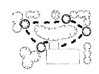
Figure 23.
Service Area. The outdoor service area is an extension of the indoor service rooms like the kitchen, utility room and/or garage. It is a part of the overall design, but is usually screened from most parts of the living and public areas. Access from the house and from other parts of the landscape will be necessary. Sometimes vehicular access is desired. The family interview previously discussed, will determine what must be included in this area. The amount of space available and number and type of activities to be included will determine the required size.
A service area could include tool storage, work space, clothesline, garden supplies storage, trash cans, firewood and a vegetable or cut-flower garden. It is possible to have service functions in two or more locations in the landscape.
Definition and Separation of Areas. Once the activity areas have been located and ideas for development of these areas have been formulated, the need for separation of these areas is often apparent. Space can be the medium for separation when working with a larger piece of property. Most often some other type of separation is required due to the number of separate activities planned in a small area. Sometimes it is only necessary to define space with a rail fence, etc., rather than providing a complete screen or barrier. Spaces can also be separated by changes in elevation. Planters can separate areas and can be a very attractive means of defining space.
A visual screen from one direction without being a physical barrier fits the bill for some situations. Groupings of plants can be positioned to give a visual block in one direction while allowing air flow into the activity area as previously shown in Figure 12 .
The required height of a screen depends upon the elevation of the view to be screened. A screen for privacy from the neighbor's two story window will require a taller screen than one for blocking the view of a neighbor down in the valley ( Figure 24 ). Generally, a screen should be placed as close as possible to the item to be screened.
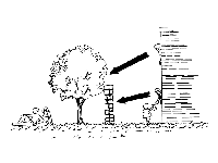
Figure 24.
Plant materials provide an inexpensive screen with color and interest. They generally require more space than fences and it takes time for them to grow to mature size. Fences provide an immediate screen, occupy little space and are quite expensive. The budget and available space will be the determining factors in this decision.
Screens can be combinations of raised land form, ground covers, small shrubs, large shrubs, and trees to give a complete or strong barrier. This combined planting is especially suited for noise abatement where the lot adjoins a busy public street ( Figure 25 ).
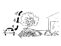
Figure 25.
Plant Selection and Placement
Plant selection is the last step in the design process. Up until this point, plant form, texture, color and size have been visualized, but now a name must be assigned to each plant. Plants are selected on the basis of climatic adaptability to the microclimate of the location, plant architecture and availability.
No matter how well a plant meets the physical characteristics for a location, if it is not adaptable to the conditions there, it will fail. These microclimate conditions include sun intensity and duration, soil conditions, rainfall, air circulation and temperature. Some plants perform better in partial or full shade than in full sun. The length of daily exposure to a particular light level also influences plant responses. Soil pH, soluble salts level and drainage properties influence plant adaptability greatly. Plants can be selected to tolerate varied soil conditions, but the designer must have a working knowledge of available plant materials.
Some locations in a landscape may be characterized by little or no air movement. Plants susceptible to mites, scales and other insects will usually be attacked more severely in areas with poor air circulation. Also locations in the landscape differ as to the maximum or minimum temperatures and daily fluctuation between these extremes. Plants can be selected to tolerate one or more of these conditions.
Plant architecture consists of form, size, texture and color. Plant form is classified as columnar, upright, spreading, broad spreading and prostrate. Plants should be selected on the basis of their mature size or a size at which they can be maintained easily. Texture is referred to as fine, medium or coarse. It is determined by branching habit, leaf size and shape, leaf arrangement, leaf color and leaf surface texture (dull or glossy). Plant color is determined by the foliage, flowers and/or fruits. Knowledge of a plant's seasonal color variations is essential.
Landscape designers must also be aware of insect and disease problems for plants they expect to include in a plan. Desirable plants are those resistant to or tolerant of pests like mites, scale, nematodes, borers, root rots, powdery mildew, wilts, galls, blights, and leaf spots. Plants in some locations must be tolerant of human abuse, air pollution and animals.
Usually, plants should be spaced with consideration to their mature size. Plants in large areas or groups are generally spaced to cover an area in 3 to 5 years. Plants should be spaced far enough from the house so that there is adequate air circulation near the house. Generally, space plants from the house by at least the distance of the plant radius at maturity. Spacing plants too close to the house is a common mistake.
Minimal Maintenance Considerations. Maintenance cannot be avoided, but it can be minimized. Even the perfectly designed and installed landscape will fail if maintenance fails. However, many maintenance problems are designed into landscapes.
Complex designs usually require more maintenance. Simplicity can be achieved by avoiding unnecessary detail. Limit the number of plant species and create well-defined planted areas by not scattering plants throughout open areas.
Design the appropriate size of maintained area and arrange plants in groups of like species to create a mass effect. Tree beds can eliminate trimming, reduce lawn mower damage to tree trunks and increase the speed of mowing. Edging of beds creates a sharp clean line and reduces maintenance requirements.
Make sure bed lines encompassing a lawn area meet at angles greater than 90 degrees. Walk, driveway and patio surfaces that are in grassed areas should be above the ground level. Avoid improper plant selection, spacing and installation that can cause maintenance headaches.
Footnotes
This document is Circular 536, Florida Cooperative Extension Service, Institute of Food and Agricultural Sciences, University of Florida. This information supports Environmental Landscape Management, i.e., landscape design and management for environmental horticulture. Publication date: June 1991.
Dewayne L. Ingram, former professor and extension horticulturalist, Environmental Horticulture Department, Cooperative Extension Service, Institute of Food and Agricultural Sciences, University of Florida, Gainesville FL 32611.
